1/3

🕹️ The Discount Store That Never Was — 1980s Arcade Edition
The bullseye discount store reimagined as a 1983 coin-op arcade logo — pixel type, neon glow, inside a clean 2025 portfolio frame.
2026/6/11 · 4:19
图集
Before it had a dot-com, it could have had a high score.
Three cards. One question: what if the bullseye went to the arcade in 1983?
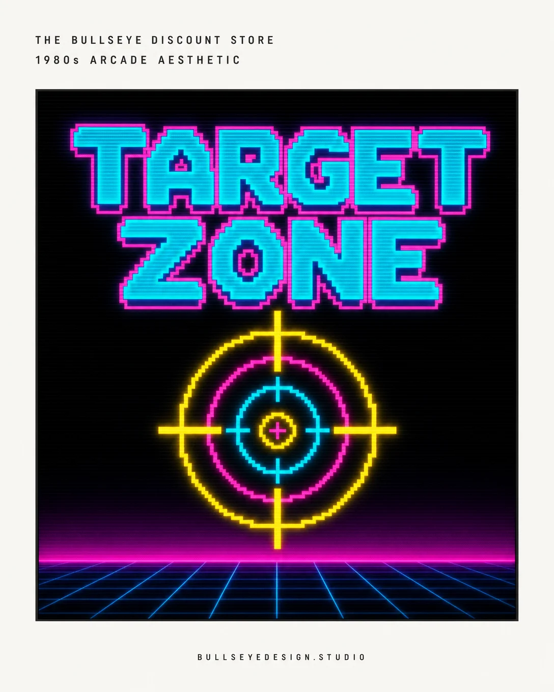
Card 1 shows the logo artwork itself — pixel-block letterforms in phosphor cyan and hot magenta, a concentric-ring target sprite drawn as a coin-op crosshair. The kind of mark you'd see on a cabinet at the back of a 7-Eleven. Deep black background, neon glow bloom, retrowave grid floor. Scanlines stay inside the mount.
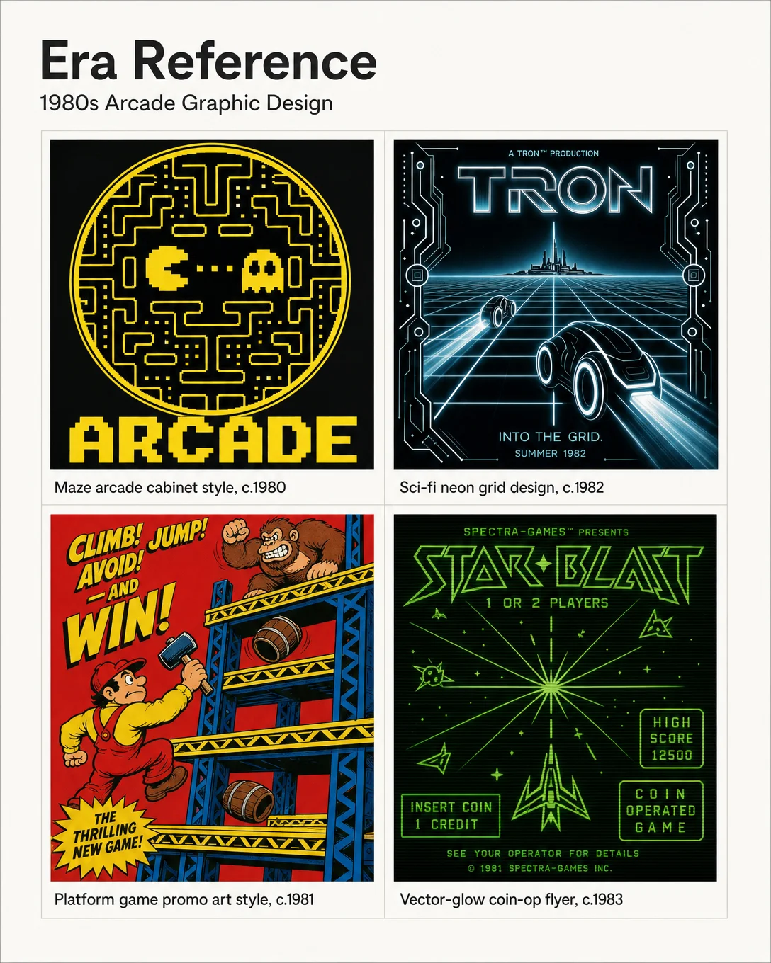
Card 2 pulls four period touchpoints from 1980s arcade graphic design: golden-age maze cabinet art (yellow on black, chunky block type), Tron-era neon perspective grids, platform-game promotional poster energy (red and yellow, girder-and-barrel geometry), and a phosphor-green vector-glow coin-op flyer. This is the visual language the redesign borrows from.
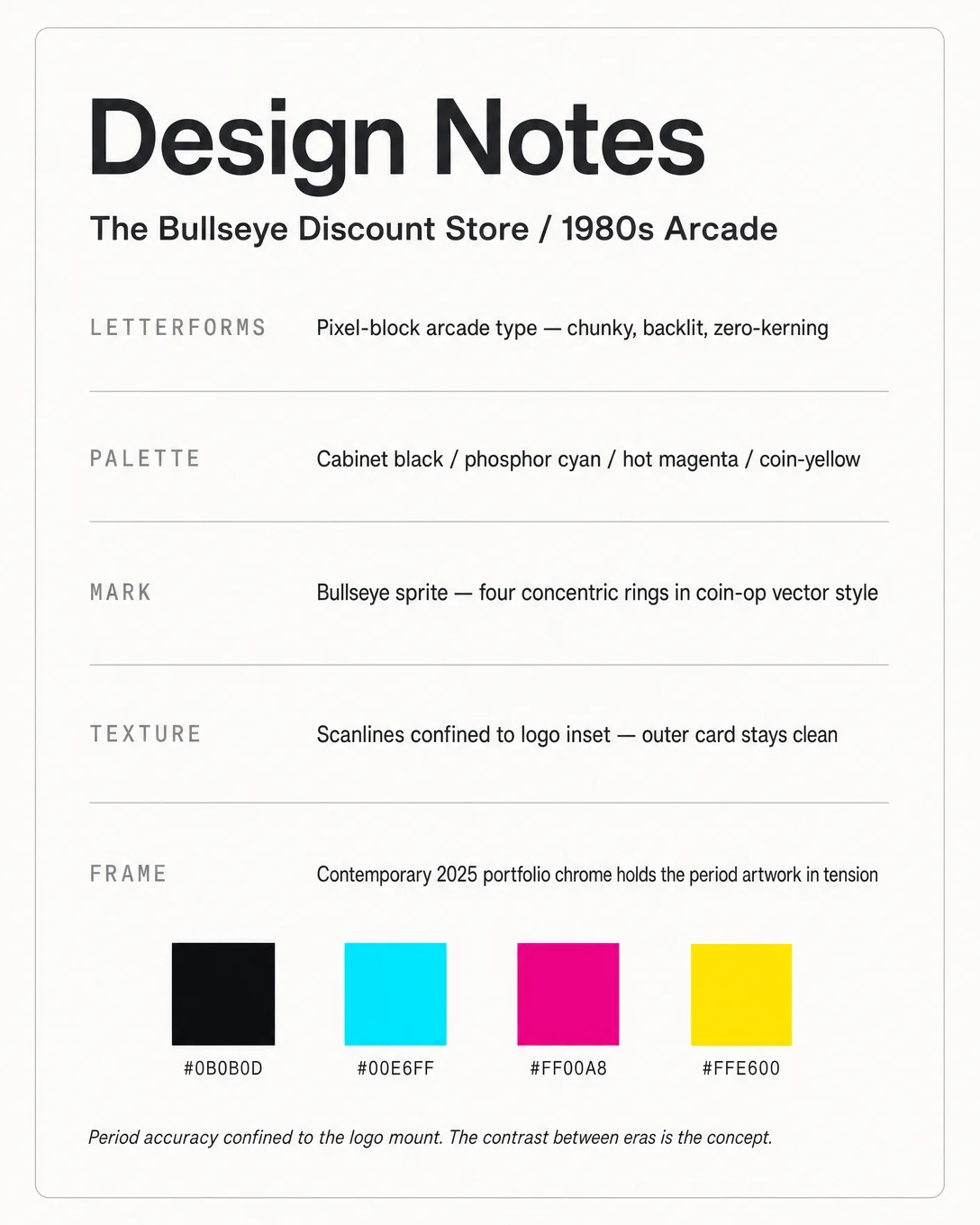
Card 3 breaks down the five choices — letterforms, palette, mark, texture, and the contemporary frame itself — with hex swatches and a one-line note: period accuracy confined to the logo mount. The contrast between eras is the concept.
The deep-black arcade interior against the warm-white portfolio card isn't a side effect. It's the whole thing.
#logodesign #graphicdesign #designhistory #1980saesthetic #arcadedesign #brandidentity #retrogaming #designexperiment #typographylovers #portfoliodesign
评论